GRAPHIC DESIGN
By Prince Lovasoas Berlier


1. Project 3: Logo Design & Brand Guidelines
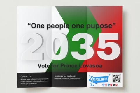
The story behind this logo is about my dream to become a future president of Madagascar one day. The year on the logo confirmed that dream, and moto used for the future propaganda.
I am really proud of this project, especially about this logo because it is a simple logo but represent many things in the Malagasy history.
The logo is built with 4 colors, which is black and white for the font, white, green, and red for the background.
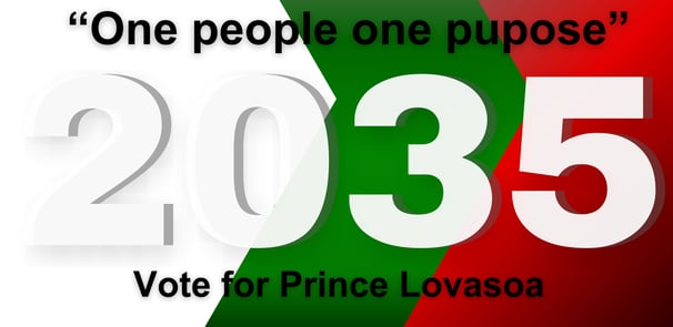
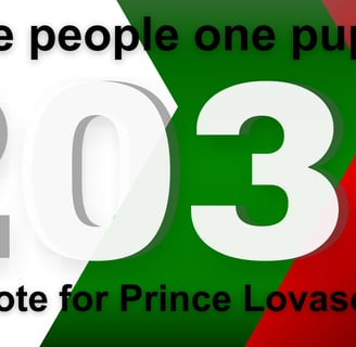
The three colors white, green and red represent the color of the Malagasy flag. As it appear, it is like the logo is built from the idea of emphasizing the Malagasy flag which is very patriotic. The background is design with a shapes that I formed to make a arrow from the left side pointing to the right side which represent that mentality of always going forward, and development.
There are 4 keys element in this design that contribute to its appeal and effectiveness. The first one is the colors. Any Malagasy people will think about the flag when they will see it for the first time. The second one is the year written on the logo. People will know the exact year of the candidature and the propaganda and the election. This point shares the accuracy of the information given from the logo. The third one is the slogan. This is a slogan easy to remember and represent the main purpose and the description of the marketing. The last one is the call to action " vote for Prince Lovasoa". Every design should have a call to action, no matter if it directly or indirectly. This call to action is simple, direct and effective.
With those four keys element in this graphic design, I believe this is going to be successful and will bring a lot of customers.
2. Project 4: Trifold Brochures
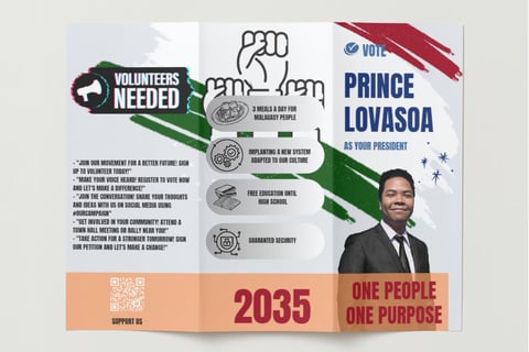
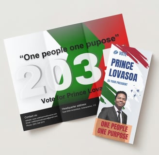
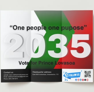
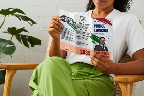
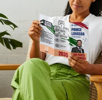
This brochure is made to to reach every single one of the customer for the propaganda. A hard copy like this is easy to remember and creates a sentiment of belonging. When the brand is in the hand of the customer, that will create a deep relationship to the brand. They will read it, discus about it, share it to their friend and that is the main goal of the brochure and those activities are more powerful than the activities on social media.
This brochure was made from the logo that we have seen before. The 3 main primary color remain the same but some descriptions and call to action were added and adjusted. As we can see, contact information, address, social media presence, were added. Those will contribute to make the customer to answer the call to action. Qr code we added on the front and back of the page to make it easier for those who love to go digital.
The most powerful part of this brochure is found on the middle part of the front of the brochure, where we can see the projects and program that will be make if the election will be successful. It was made easy to read, with graphics and font that catches the eyes easily.
